For the longest time, I've recorded by personal expenses using Google Sheets. Adding expenses on Google Sheets has always been clunky and difficult on my phone, so I decided to create a Google Form to make this easier.
This made adding expenses way easier, especially on mobile. But being a a software and product engineer, I thought I could take this further and create a full-fledged expenses application using a Google Forms and Google Sheets as the backend.
UI Inspiration: Apple wallet
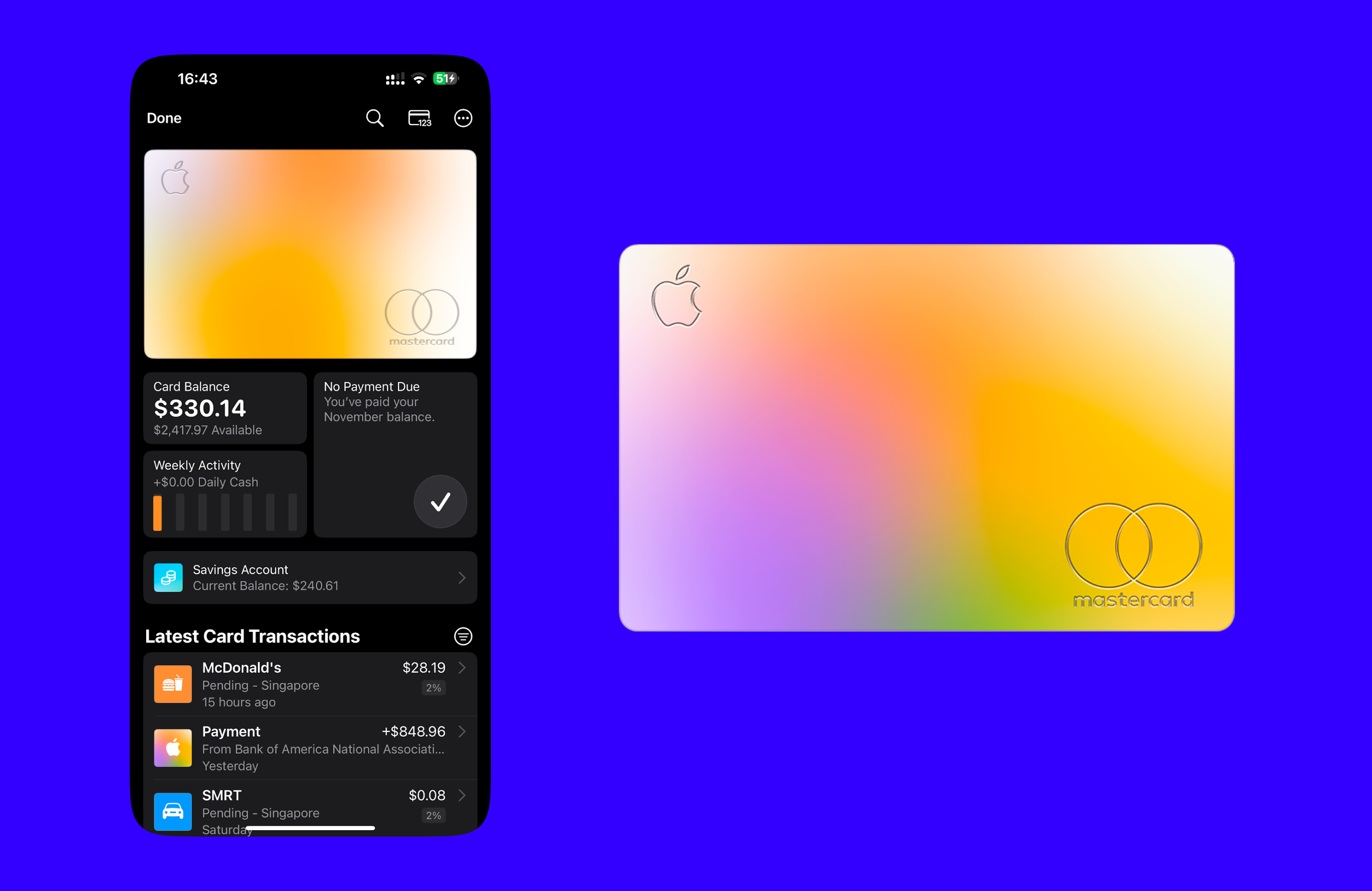
I really like the colors and list view of Apple Wallet. I like to see a quick summary of my month's spendings with the overall colors of the Apple Card.
Initial UI
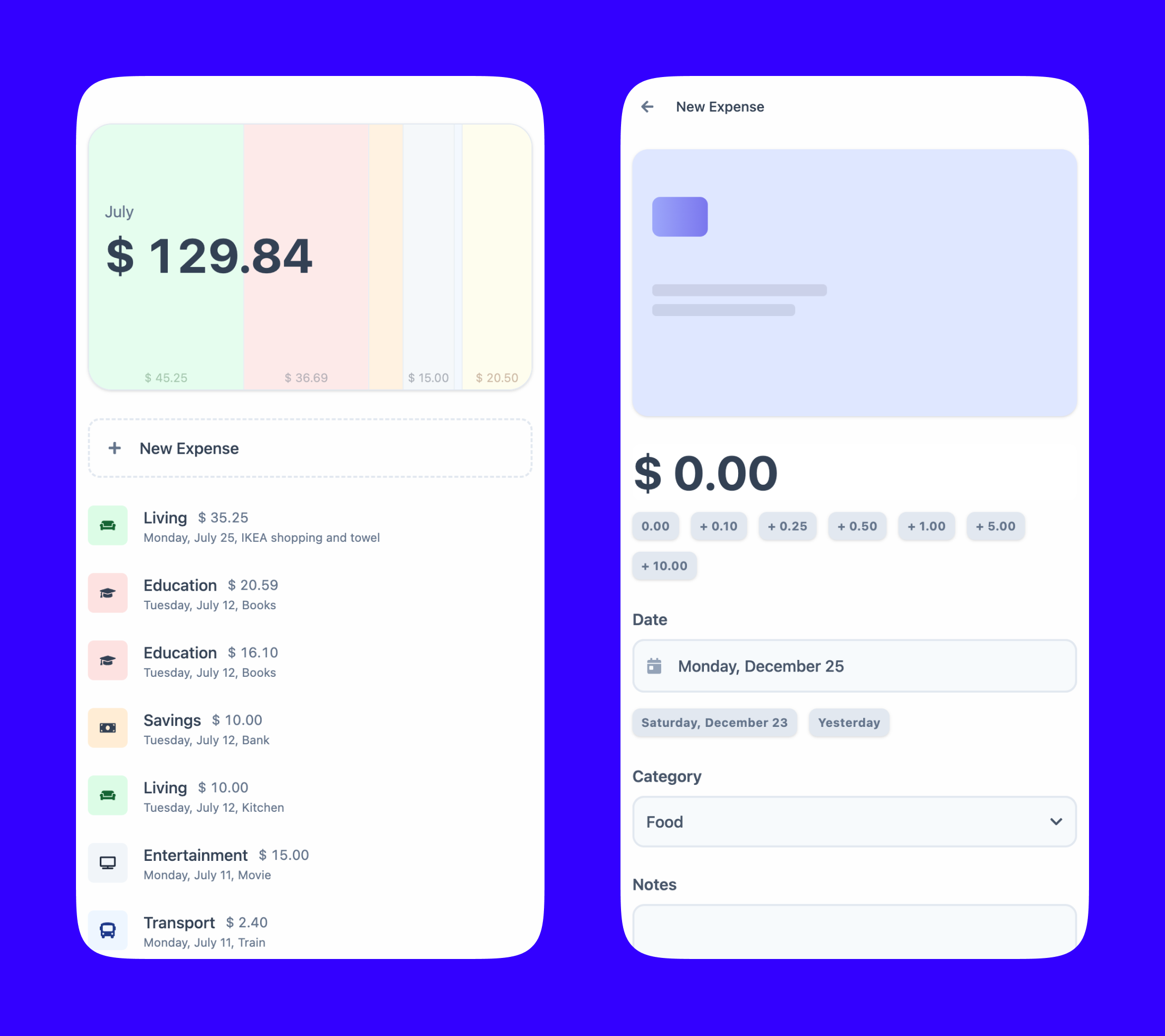
Left side: expenses view and summary
- This view shows the spending by month.
- The "card" on the top shows a breakdown of spending by category through the colors. In this example, the most has been spent on the "Living category".
- Every individual expense/transaction can bee seen below.
Right side: add expense form
- An amount can be entered either by typing or by using the buttons.
- For example, rather than typing "7.35", the user can press the "+5.00", the "+1.00" button twice, the "+0.25", then the "+0.10" button.
- react-number-format was helpful for the number input.
- To enter the date, either the date picker, or the quick buttons for "yesterday" or "day-before yesterday" can be used.